
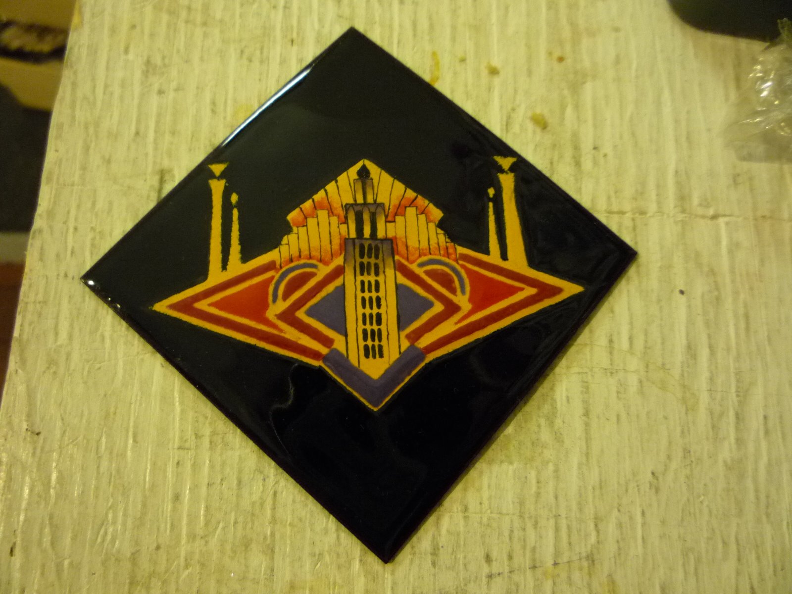
Art Show Awards for MidAmeriCon II

This was is the logo for MidAmeriCon II in Kansas City, MO this week-end. I was asked by Sam Press to design some awards, based on the logo, for the art show. I liked it so much I decided to re-produce it as closely as possible

I decided to work with stencils and start from the Yellow ground. This is Thompson 1238 Ivory. I use 100% rag vellum for my stencils. You can wet them over and over and they never lose their shape. The ability to wet them means they cling to the enamel surface very well and give nice clean lines.
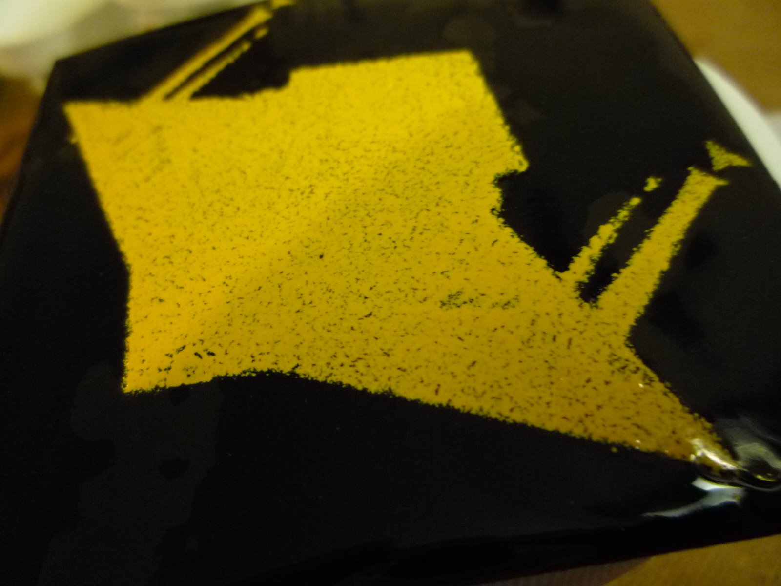
Even though the layer was quite thick you can see that it didn’t cover completely.
It was easy enough to line up the stencil and do a second layer

I sifted the second layer

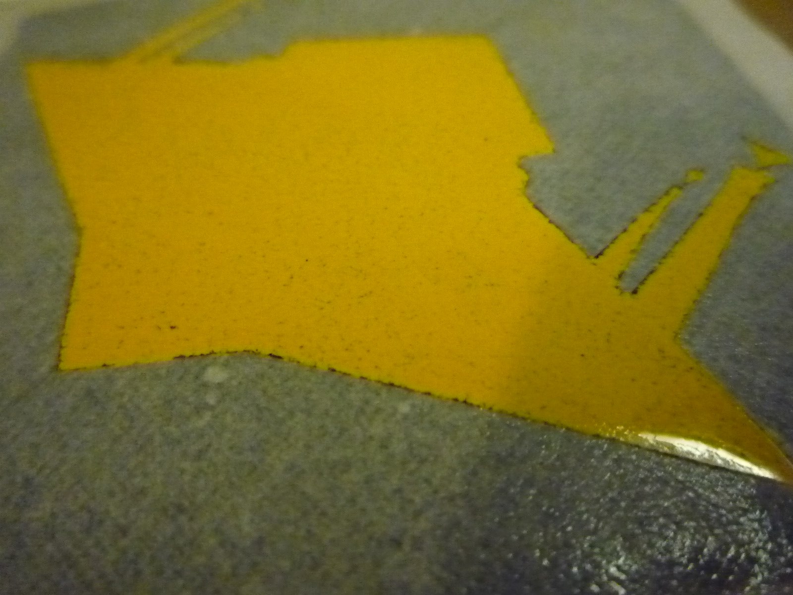
And it came off beautifully clean

It took three layers, in the end, to give a good cover to the black
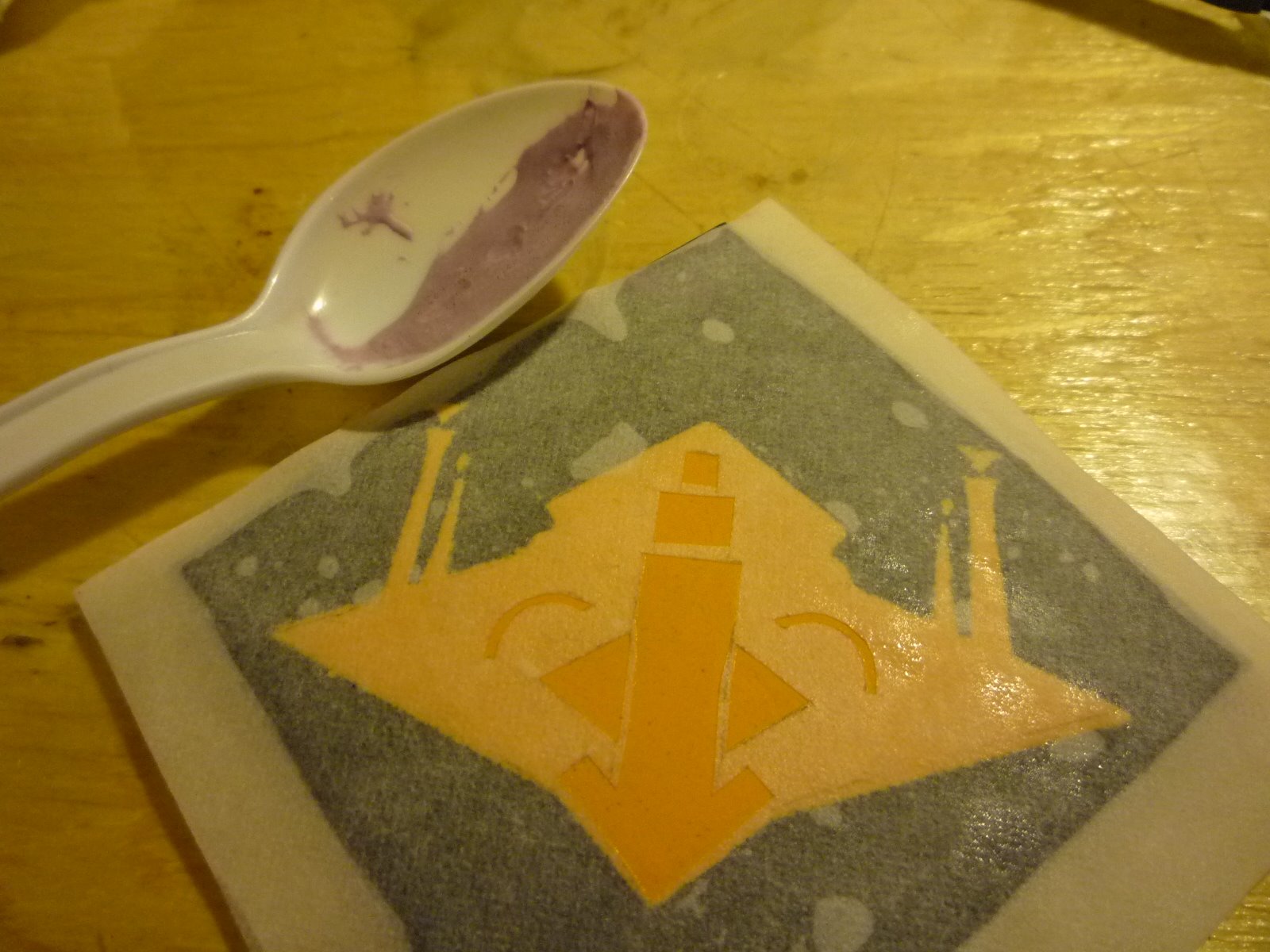
To do the detail colours I sifted them down to 325 mesh so that the lines would be cleaner. They were too fine to sift evenly so…

I wet them and laid them into the stencil with a brush

The lines were finer than the general outline when I pulled the stencil away

I fired the purple (1780 Grape) first because it was a little harder than the other colours and could withstand another couple of firings.
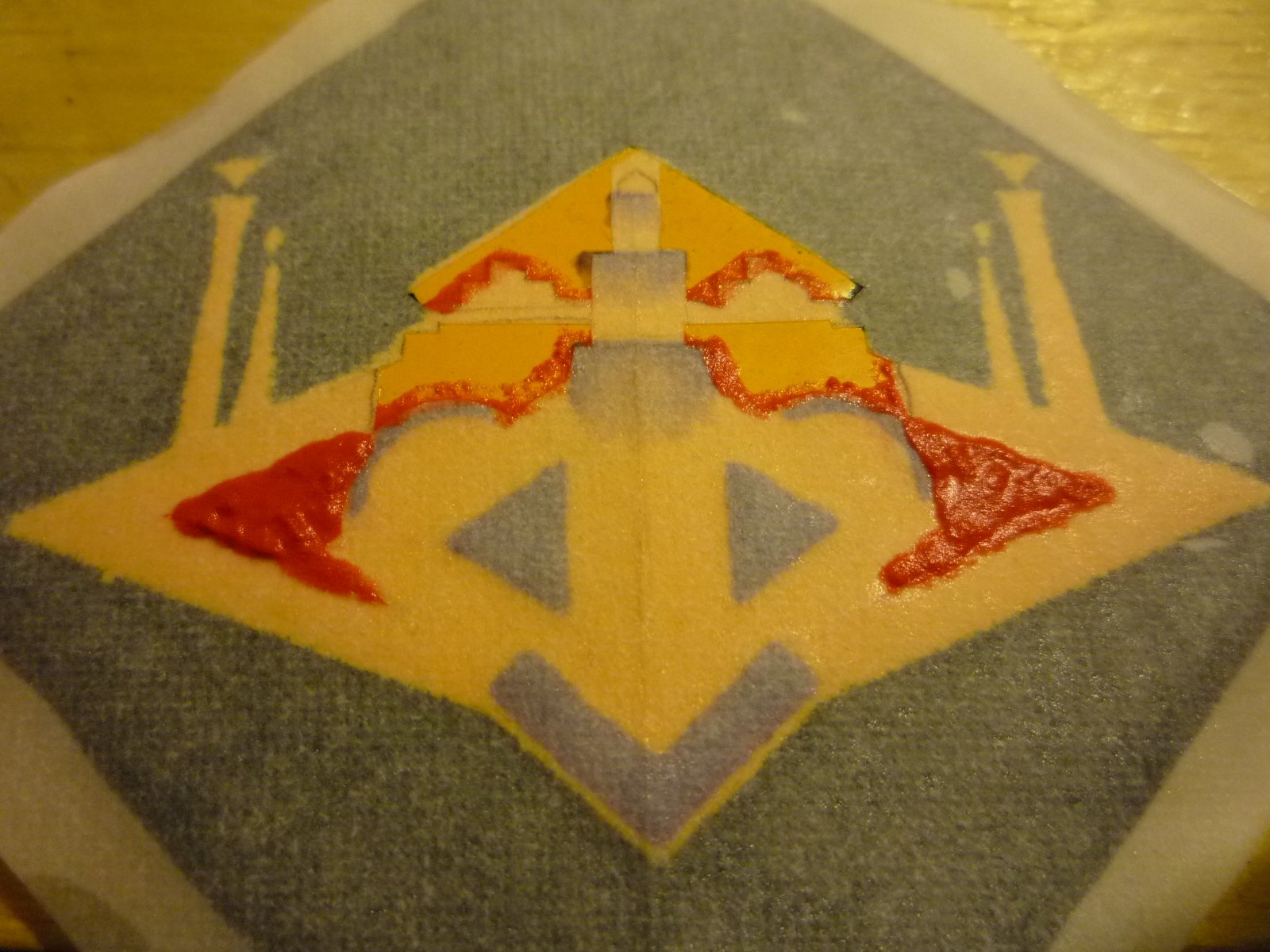
Then I laid in the orange (1870 Flame Orange)
…fired it …
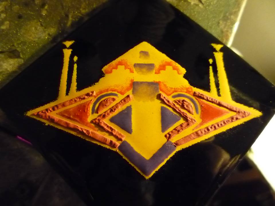
And finally the red (1880 Flame Red)
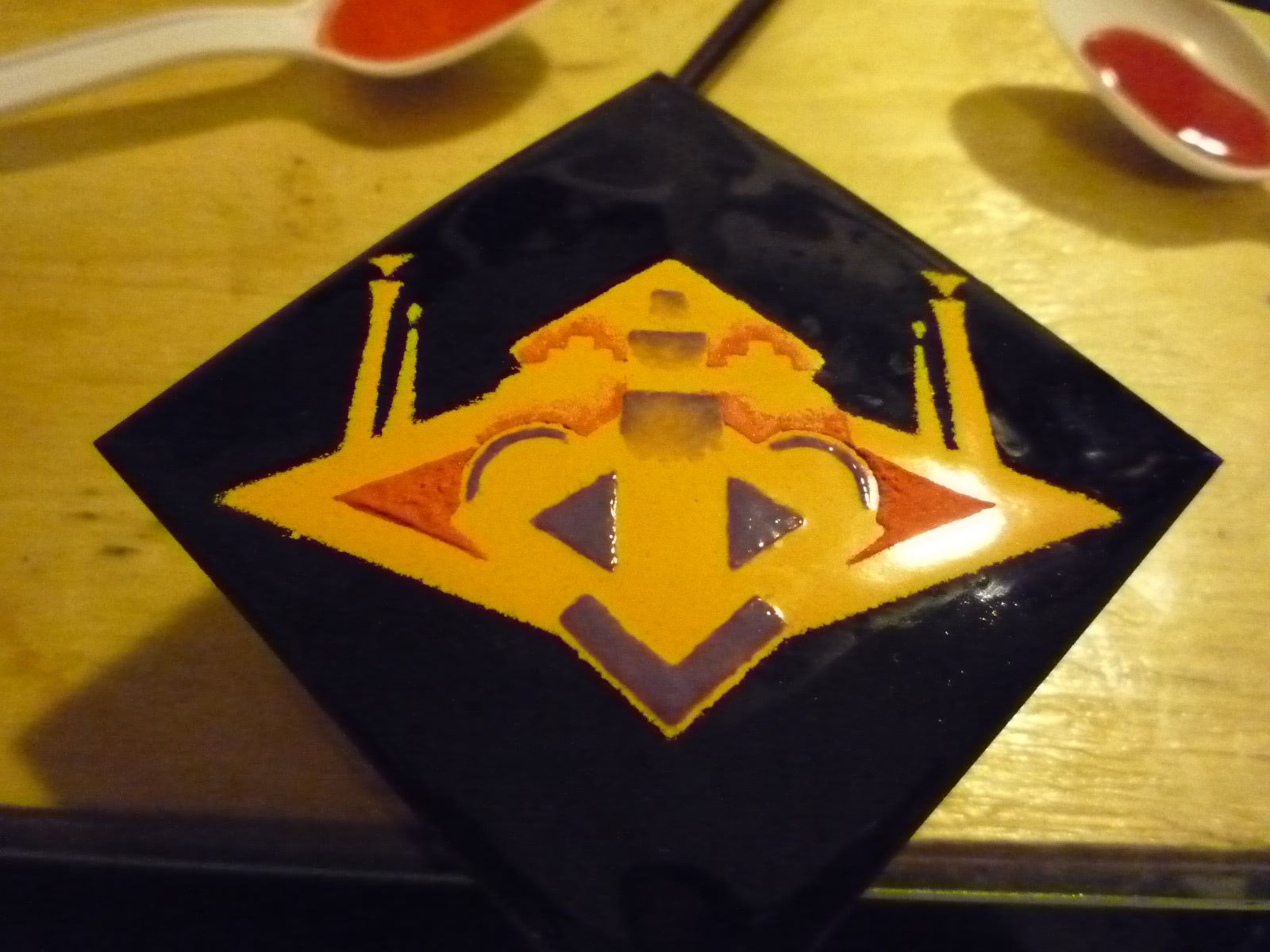
Finally the most difficult and time consuming was laying in the black lines. This was the prototype

The finished pieces also had some more detail on the side towers
I made five pieces in all. Since I started going to WisCon (feminist Science Fiction and Fantasy Convention in Madison Wisconsin) – I have found the Science Fiction and Fantasy community to be incredibly supportive of visual artists. Many thanks to them, and especially Sam Press for commissioning this work, and mounting it so beautifully!


Great work Catherine!